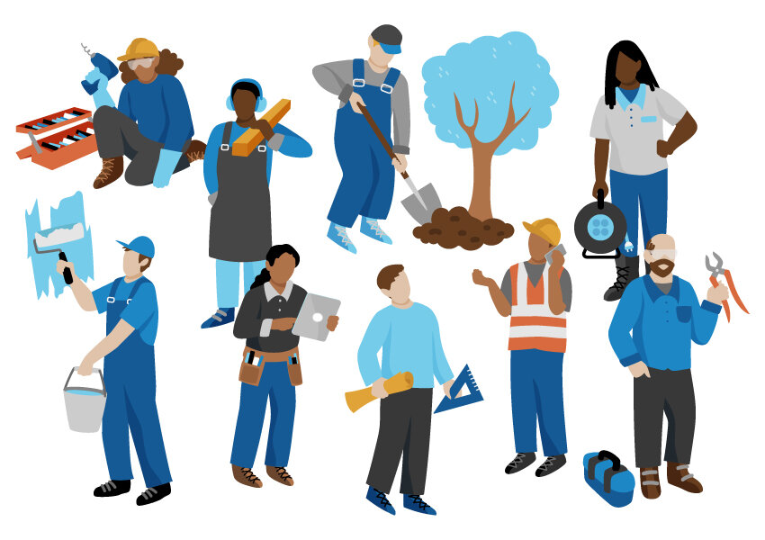
I’ve recently been working on a new series of vector illustrations for Craftview, a company which puts softwares for woodworkers, landscapers, construction workers, etc, all in one place.
Anyway, I never thought that I could do corporate-type vector illustrations or include that “style” into my portfolio somehow, but this project gave me the push to try. And, save for the line work that is normally evident in my work, I think it kinda fits with the rest of what I do? I mean, it’s people-focused and the characters look approximately the same, shape-wise. Let’s see what my agency (and the world) thinks. I hope this can open some new doors!
BTW, in order to keep the style somewhat in line with my other work, I did my thumbnail sketches the way I normally would, but then simply did a shape-based execution in illustrator (using mainly the pencil tool, not the pen tool, as this works with the organic shapes in my work).
What I appreciated / found interesting about this process: I felt like I was building dolls, but in 2D, and there were many instances where I could simply copy and paste existing shapes (heads, arms, legs…) to build new ones. Working with vector also means you can have the final output be virtually any size, but… that’s a given.


