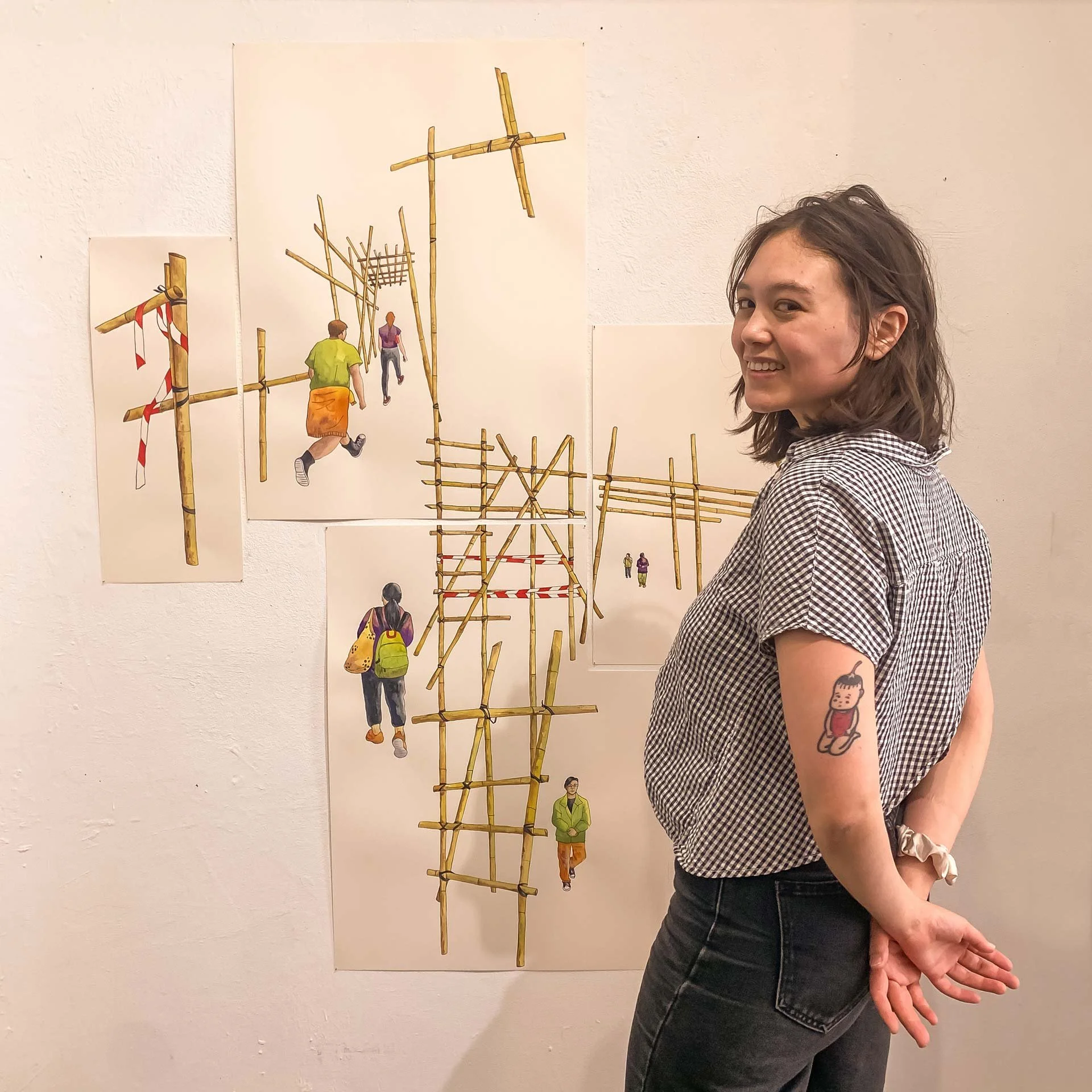
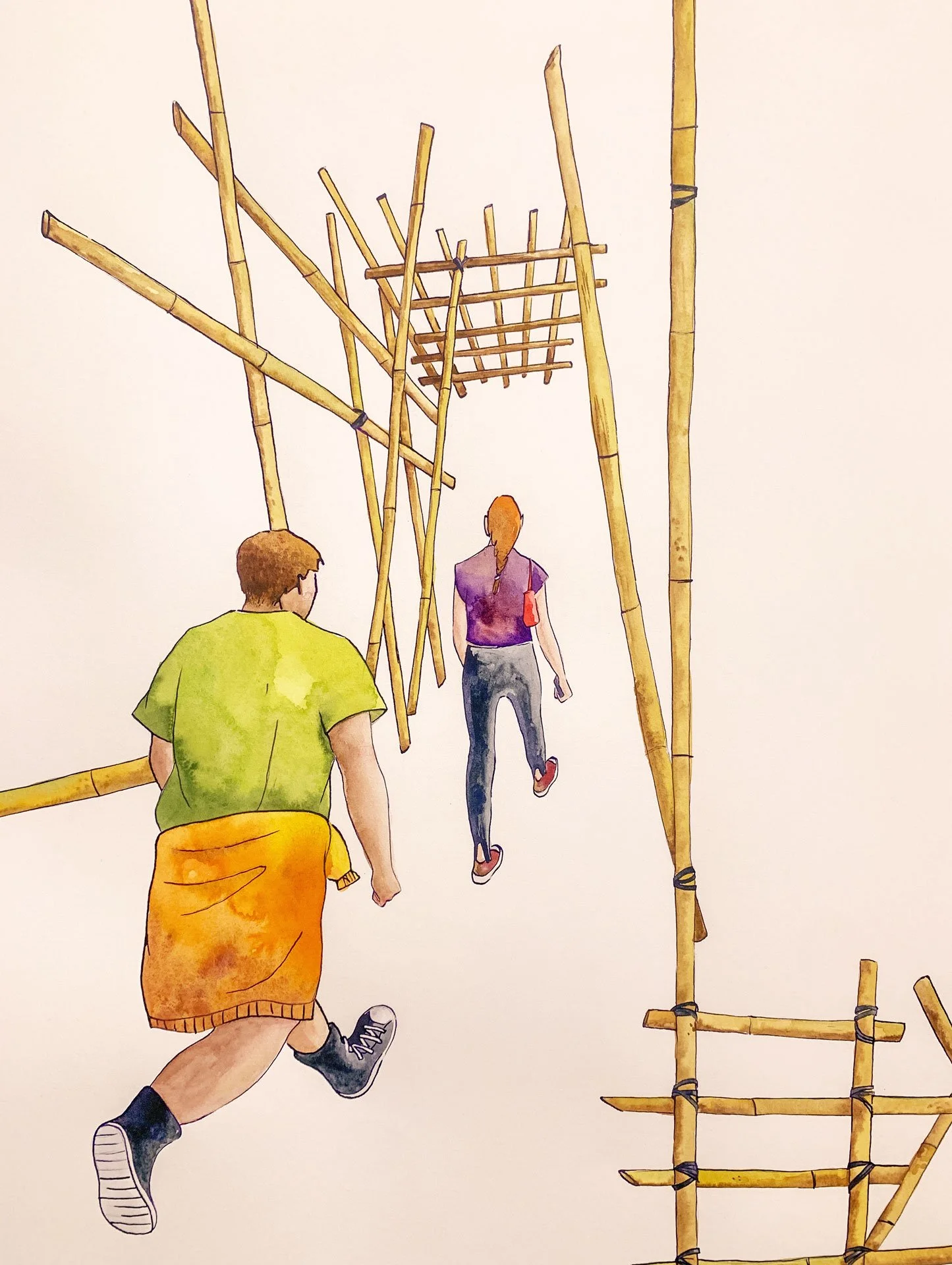
2024 so far: giving a talk about illustration as a career at a university, poster for a children’s theatre production of The Odyssey, and my second mural in Hong Kong :)
Read MoreTurning my illustrations into GIFs (illustration process + intermediate Photoshop tutorial)
This is my first time animating my drawings beyond simply Lasso-tool-ing and pivoting a limb in a drawing, or making colours fade in/out. There was a lot of back and forth, making it hard to trace my steps, but I’ll try my best to give you as streamlined a version of the process as possible. I’m also going to focus my explanation mainly on one illustration, Mobilwende, but I will also sprinkle in some insights from the others I did (a total of three animated illustrations).
Read MoreIllustration for Spectre Journal, “Labor Noir” — Editorial Illustration process
I want to talk about how I created this illustration for the new issue of Spectre Journal; let’s jump right into it!
1 / It’s important to first know the specs. In this case it was a 8 x 10” full page illustration (300dpi, CMYK) with 0.125” bleed. The article talks about how the mafia and politicians oppressed and exploited waterfront workers, longshoremen, in 1930s Brooklyn. I had two weeks to finish the illustration. The art director was open to my ideas; I read the article a few times and highlighted some keys words and phrases in order to evoke some fitting imagery in my mind. I also collected many references photos of the subject matter and people mentioned in the article; I even watched some documentaries to get to know the mafioso (some of them are quite famous) and what life was life for longshoremen at the time.
2 / I sent two thumbnails to the art director. One was more detailed and narrative (1), showing the key “players” and events that the article deals with. The second was more metaphorical (2), showing the weight of exploitation “carried” by the worker. The art director went with the first idea (which is the one I also preferred), but asked if I could take out the three portraits in the centre of the image, and replace it with something less figurative, for example the scenery of the Brooklyn waterfront. This was a huge challenge for me, as suddenly, I was left with a big hole in my composition! But I agreed that the first draft was too busy, and I needed to challenge myself to bring more negative space and balance into the illustration (that this is something I need to work on in general).
3 / Amending the composition: I tried two different things here. The first was to incorporate the waterfront and a bit of the Brooklyn bridge. I liked how it looked in the thumbnail (see: composited thumbnail), but somehow, when it came to drawing the final, it looked too stiff, too technical, which didn’t fit into the organic flow of the rest of the illustration. The second idea was to incorporate only the waterfront, and have the steam flowing out from the cargo ship mirrored as an abstract shape in right hand portion of the image (see: final drawing). In both cases, I drew the original parts of the first draft, and the “new parts” separately, then composited them in Photoshop (it’s helpful to work with a light tablet here). The figures in the bottom left were also composited, in part, because I ended moving them up, and an extension of their bodies needed to be attached.
4 / 5 / Final drawing: this was simply a matter of tracing over the composited thumbnail and all the amendments I had made, enlarged to the correct size. For the pose in the top left corner of the illustration, I had two friends pose as a reference for me. At the end, I chose to forgo the bridge, and the AD approved my final drawing.
6 / Final texture and colour: for texture, I used some marks I’ve made with different media (charcoal, watercolour, graphite) that I saved in a folder a while back. Not all, just a few! Through some serendipity while screen printing throughout the week, I discovered that the ink washed out from my screens left some pretty interesting ink splotches in the bottom of the tub; I photographed and used this for the water in my illustration (you can already see it in the “final drawing” above). I scrubbed the tub clean afterwards, of course!
I decided this year that I wanted to start incorporating more texture into my illustrations in order to add visual interest without spending too much time drawing detail by hand. For colour, I decided right from the beginning that I wanted to work with a limited palette: blue, grey, and some sepia and brown tones. I also knew that I wanted to have some elements in the image that were not lined — like some of the smoke and the “crowd” in the bottom right corner. This, again, for balance and visual interest. After shading, I added a layer of halftone to some parts of the illustration — it’s something I’ve been doing for a while now which I think adds a distinctive look to my work ;)
7 / The AD was happy with the result at the end, but just wanted to desaturate the blue a bit in order to give the illustration more of a “noir” feel. Here’s the final spread, courtesy of AD Gabe Berlin:
Developing concepts for a political editorial illustration – my process
As outline in my Art Goals for 2023 post, I would like to update my portfolio with more editorial illustrations, focused on current events, especially climate change and sustainability. I prepped myself by reading lots of articles beforehand, and yesterday I started with the first concept thumbnails.
I decided on a landscape, kind of long-ish layout, as this seems to be the usual in online news outlets as well as newspapers.
In terms of composition, these illustrations will need to be more focused on their main concepts, less reliant on minute details filling in the background – which I am prone to do, it is both my strength and my weakness! I am making this judgment based on other editorial illustrations I have seen in this field. So, I slight shift in my style will be needed for this brand of illustration (I also wrote about this in my art goals blog post, linked above).
Adjusting to this was not easy at all, and in total I took about 2 hours and 40 - 50ish minutes to come up with three thumbnails! And only two of them are related to the same topic (transition to public mobility in Germany) – the other one addresses both transition of mobility and transition to renewable energies.
addendum: in all fairness, I should add that this was my first time drawing again after the long winter break, so I was a bit rusty. The following days I was able to draft my ideas more quickly.
Starting an illustration on the transport/mobility revolution in Germany, mostly based on this article.
Some takeaways:
1. The beginning is always the hardest, but you’ll get into the flow. Hour one I was really struggling. By hour two I was super in the flow. Then by hour three, I was feeling my will break a little lol.
2. I DO NOT KNOW how to draw bikes. A little trouble shooting was required (practice drawing bikes in different angles), but realistically I know that, if this were a client project, I wouldn’t be able to stray too far off the path. There’s no time for crash courses – just make it work. By the way, I found this video by Robert Laszlo Kiss very helpful in explaining how to draw bikes from different angles, and I’ll probably apply this technique to other subject matter in future.
3. It’s super important to take BREAKS! I’m not just saying this to be your nice auntie, I’m saying this because it’s part of the strategy. Your brain needs down time to process the problem, and to solve it later. In my breaks I…
took a nap
had my meals / snacks
did 15 minutes of yoga
played my keyboard
played Sims 4 lol (but only after I was done working for the day)
All together my breaks were about 30 - 40 minutes a piece, in between the one hour long phases of work. Perhaps you might think, “Damn, 2h 40m is not a lot of work AT ALL” – and it isn’t, but, it was focused, undistracted work, and I think that’s much more efficient than doing 10 other things while working. To be fair, if this were indeed a client project, I’d probably be pushing myself to work more, with shorter breaks, due to the extra fire under my ass.
** please bear in mind I also have house hold tasks, groceries, pet care, other freelance/admin tasks, and sometimes English tutoring to attend to, and I also consider this work **
I also have a rule of not working past 6.00 - 6.30PM (unless it’s tutoring English) because, otherwise, I really have trouble sleeping. Work = my caffeine
4. Soothing study sounds: listening to calming ambient music or even these café sounds help me focus without becoming terribly stressed out by the surrounding silence. I think it’s “proven” that ambient music helps with studying/focused work, but don’t quote me on that.
5. Shifting but still working towards the goal: As I mentioned, by hour three of work I was feeling my will break a little, and my hand was a bit sore, so I focused that time on learning more about the topic I was trying to illustrate (via podcast, articles, educational videos, etc). In total, that brought me to 3.5 hours of “work”.
6. Pretend you’ve actually been hired: it’s easier to come up with a concept by taking an existing (ideally un-illustrated) article and creating a visual for that, rather than illustrating a broad topic. Bonus: the specific can be universal – as long as it’s not too specific. For example: an illustration on the transport/mobility revolution in Germany, if created in a way that leaves room for interpretation, but is still clear in its messaging, has the potential to be applied in other contexts.
7. How detailed should the thumbnails be? In my thumbnails I try to achieve a balance between clearly communicated ideas + not too many details. That means: proportions and “recognisability” have to be quite accurate, so the client (if there were one) would be able to understand my idea. I can’t allow myself to fall into the trap of wasting time on details. A few written notes on the side could be helpful, too – much tidier than in the examples I have provided, mind you!
( Something I’m not 100% sure about is if it’s customary to create two or three initial thumbnails (in a client project context). For most of my client projects so far, I would literally just do one concept for each illustration, and the client would decide from there. These weren’t for newspapers or political topics though, so I’m not sure. I’m practicing with a process that includes three thumbnails, just to be safe 🤷🏻♀️ )
Anything I missed or you would like to share? Feel free to leave a comment below ~