As other artists do, I feel the same fear that the devastation of AI could bring upon an industry that we’ve built by our own hands. And yet, I hate the usual dichotomy in which we draw comparisons between AI and humans; AI – cold, technologically superior, feelingless; human – flawed, visceral, and mortal. It’s clear who gains the moral upper hand in this framing, by mere virtue of us refusing to imagine further than that (how boring). And I hate being put in the position of picking a side, because in all truth, I love Data – data with a capital D, that is, the lovable android from Star Trek.
Read MoreIllustration for Spectre Journal, “Labor Noir” — Editorial Illustration process
I want to talk about how I created this illustration for the new issue of Spectre Journal; let’s jump right into it!
1 / It’s important to first know the specs. In this case it was a 8 x 10” full page illustration (300dpi, CMYK) with 0.125” bleed. The article talks about how the mafia and politicians oppressed and exploited waterfront workers, longshoremen, in 1930s Brooklyn. I had two weeks to finish the illustration. The art director was open to my ideas; I read the article a few times and highlighted some keys words and phrases in order to evoke some fitting imagery in my mind. I also collected many references photos of the subject matter and people mentioned in the article; I even watched some documentaries to get to know the mafioso (some of them are quite famous) and what life was life for longshoremen at the time.
2 / I sent two thumbnails to the art director. One was more detailed and narrative (1), showing the key “players” and events that the article deals with. The second was more metaphorical (2), showing the weight of exploitation “carried” by the worker. The art director went with the first idea (which is the one I also preferred), but asked if I could take out the three portraits in the centre of the image, and replace it with something less figurative, for example the scenery of the Brooklyn waterfront. This was a huge challenge for me, as suddenly, I was left with a big hole in my composition! But I agreed that the first draft was too busy, and I needed to challenge myself to bring more negative space and balance into the illustration (that this is something I need to work on in general).
3 / Amending the composition: I tried two different things here. The first was to incorporate the waterfront and a bit of the Brooklyn bridge. I liked how it looked in the thumbnail (see: composited thumbnail), but somehow, when it came to drawing the final, it looked too stiff, too technical, which didn’t fit into the organic flow of the rest of the illustration. The second idea was to incorporate only the waterfront, and have the steam flowing out from the cargo ship mirrored as an abstract shape in right hand portion of the image (see: final drawing). In both cases, I drew the original parts of the first draft, and the “new parts” separately, then composited them in Photoshop (it’s helpful to work with a light tablet here). The figures in the bottom left were also composited, in part, because I ended moving them up, and an extension of their bodies needed to be attached.
4 / 5 / Final drawing: this was simply a matter of tracing over the composited thumbnail and all the amendments I had made, enlarged to the correct size. For the pose in the top left corner of the illustration, I had two friends pose as a reference for me. At the end, I chose to forgo the bridge, and the AD approved my final drawing.
6 / Final texture and colour: for texture, I used some marks I’ve made with different media (charcoal, watercolour, graphite) that I saved in a folder a while back. Not all, just a few! Through some serendipity while screen printing throughout the week, I discovered that the ink washed out from my screens left some pretty interesting ink splotches in the bottom of the tub; I photographed and used this for the water in my illustration (you can already see it in the “final drawing” above). I scrubbed the tub clean afterwards, of course!
I decided this year that I wanted to start incorporating more texture into my illustrations in order to add visual interest without spending too much time drawing detail by hand. For colour, I decided right from the beginning that I wanted to work with a limited palette: blue, grey, and some sepia and brown tones. I also knew that I wanted to have some elements in the image that were not lined — like some of the smoke and the “crowd” in the bottom right corner. This, again, for balance and visual interest. After shading, I added a layer of halftone to some parts of the illustration — it’s something I’ve been doing for a while now which I think adds a distinctive look to my work ;)
7 / The AD was happy with the result at the end, but just wanted to desaturate the blue a bit in order to give the illustration more of a “noir” feel. Here’s the final spread, courtesy of AD Gabe Berlin:
Developing concepts for a political editorial illustration – my process
As outline in my Art Goals for 2023 post, I would like to update my portfolio with more editorial illustrations, focused on current events, especially climate change and sustainability. I prepped myself by reading lots of articles beforehand, and yesterday I started with the first concept thumbnails.
I decided on a landscape, kind of long-ish layout, as this seems to be the usual in online news outlets as well as newspapers.
In terms of composition, these illustrations will need to be more focused on their main concepts, less reliant on minute details filling in the background – which I am prone to do, it is both my strength and my weakness! I am making this judgment based on other editorial illustrations I have seen in this field. So, I slight shift in my style will be needed for this brand of illustration (I also wrote about this in my art goals blog post, linked above).
Adjusting to this was not easy at all, and in total I took about 2 hours and 40 - 50ish minutes to come up with three thumbnails! And only two of them are related to the same topic (transition to public mobility in Germany) – the other one addresses both transition of mobility and transition to renewable energies.
addendum: in all fairness, I should add that this was my first time drawing again after the long winter break, so I was a bit rusty. The following days I was able to draft my ideas more quickly.
Starting an illustration on the transport/mobility revolution in Germany, mostly based on this article.
Some takeaways:
1. The beginning is always the hardest, but you’ll get into the flow. Hour one I was really struggling. By hour two I was super in the flow. Then by hour three, I was feeling my will break a little lol.
2. I DO NOT KNOW how to draw bikes. A little trouble shooting was required (practice drawing bikes in different angles), but realistically I know that, if this were a client project, I wouldn’t be able to stray too far off the path. There’s no time for crash courses – just make it work. By the way, I found this video by Robert Laszlo Kiss very helpful in explaining how to draw bikes from different angles, and I’ll probably apply this technique to other subject matter in future.
3. It’s super important to take BREAKS! I’m not just saying this to be your nice auntie, I’m saying this because it’s part of the strategy. Your brain needs down time to process the problem, and to solve it later. In my breaks I…
took a nap
had my meals / snacks
did 15 minutes of yoga
played my keyboard
played Sims 4 lol (but only after I was done working for the day)
All together my breaks were about 30 - 40 minutes a piece, in between the one hour long phases of work. Perhaps you might think, “Damn, 2h 40m is not a lot of work AT ALL” – and it isn’t, but, it was focused, undistracted work, and I think that’s much more efficient than doing 10 other things while working. To be fair, if this were indeed a client project, I’d probably be pushing myself to work more, with shorter breaks, due to the extra fire under my ass.
** please bear in mind I also have house hold tasks, groceries, pet care, other freelance/admin tasks, and sometimes English tutoring to attend to, and I also consider this work **
I also have a rule of not working past 6.00 - 6.30PM (unless it’s tutoring English) because, otherwise, I really have trouble sleeping. Work = my caffeine
4. Soothing study sounds: listening to calming ambient music or even these café sounds help me focus without becoming terribly stressed out by the surrounding silence. I think it’s “proven” that ambient music helps with studying/focused work, but don’t quote me on that.
5. Shifting but still working towards the goal: As I mentioned, by hour three of work I was feeling my will break a little, and my hand was a bit sore, so I focused that time on learning more about the topic I was trying to illustrate (via podcast, articles, educational videos, etc). In total, that brought me to 3.5 hours of “work”.
6. Pretend you’ve actually been hired: it’s easier to come up with a concept by taking an existing (ideally un-illustrated) article and creating a visual for that, rather than illustrating a broad topic. Bonus: the specific can be universal – as long as it’s not too specific. For example: an illustration on the transport/mobility revolution in Germany, if created in a way that leaves room for interpretation, but is still clear in its messaging, has the potential to be applied in other contexts.
7. How detailed should the thumbnails be? In my thumbnails I try to achieve a balance between clearly communicated ideas + not too many details. That means: proportions and “recognisability” have to be quite accurate, so the client (if there were one) would be able to understand my idea. I can’t allow myself to fall into the trap of wasting time on details. A few written notes on the side could be helpful, too – much tidier than in the examples I have provided, mind you!
( Something I’m not 100% sure about is if it’s customary to create two or three initial thumbnails (in a client project context). For most of my client projects so far, I would literally just do one concept for each illustration, and the client would decide from there. These weren’t for newspapers or political topics though, so I’m not sure. I’m practicing with a process that includes three thumbnails, just to be safe 🤷🏻♀️ )
Anything I missed or you would like to share? Feel free to leave a comment below ~
My ✨ art goals for 2023 ✨
1. Have an illustration published by a (major) news outlet.
This has always been a somewhat superficial goal of mine – I say that because it seems like a cool thing to tick off of my “illustration career mile stone” check list, but I won’t be completely heartbroken if it doesn’t happen.
Some actionable steps to take in order to achieve this goal:
Update portfolio with relevant (political, current events-related) illustrations. I will be working with a topic which appeals to me but is also very relevant: climate change and transitioning to a more sustainable future. I’m aiming for 4 - 6 works. If you are interested in reading further, I wrote about it here: Developing concepts for a political editorial illustration.
I’ll need to freshen up my editorial client list, and quite possibly reach out to some old, but hot 🔥 leads.
OMG, old video alert! I made it private because I stopped cold-emailing, but the info seems relevant now.
Ultimately, I realised I had this goal because I enjoy learning and sharing important information, and sharing this via illustration. And how illustration can draw attention to critical social issues, make it more digestible, or else present it from a different perspective. So, either way, if I get published or not – at least I’ll have new pieces for my portfolio which are totally aligned with my values.
Side note – it has happened a few times that a client stumbled upon an illustration I already made and then simply paid me for the licensing. Anything can happen!
2. Cozy watercolour illustrations featuring forest goblins and faeries
I realise this is almost a complete 180 from the above, and also a topic I have never featured in my current portfolio… but I grew up reading fantasy picture books, and I love a good fantasy read even now. It’s a dream of mine to create a cozy little fairy tale escape.
My goal is to create at least 4 pieces, so it can feel like a substantial part of my portfolio, not just a one-off (though if this ends up being a one-off venture, I won’t be too hard on myself – it’s OK to explore).
3. Style changes – incorporate more texture, rely less on lined elements and details
This applies more to my editorial / client projects. I realised that, if I want to be taken seriously in the editorial field, my main concepts need to be more focused, with more room for negative space, less reliant on details. More minimal, but not necessarily easier – it can be hard to come up with strong ideas! Especially for me, I rely heavily on detail and I wouldn’t necessarily call myself a conceptual illustrator.
Second point, texture: first step would be to create some textures using different media (e.g. charcoal), scanning those in, and creating a texture library I can use for future illustrations. It seems like a fun technique I haven’t used much in my work, and I reckon it could be a quick way to add visual interest in my backgrounds if I’m not going to be drawing them by hand.
Wish me luck!
What are your art goals? Feel free to share in the comments!
2022 recap: “bad” year for freelancing, good year for life
Compared to 2021, I wasn’t very busy with client projects this year. On the one hand, it felt a little unsettling, but on the other hand, I know from shared and conventional wisdom 😉 that most businesses, freelance or not, go through their ups and down.
To recap, here’s what I worked on in 2023:
For most of the year, May - October(!) I worked on this Sex Education Brochure for WienXtra, an Austrian organisation that, in cooperation with the city of Vienna, provides information, education, events, and leisure activities for children and young people. The reason this project took so long is not the amount of work I had, but rather, limited resources / man power on the client’s side – so everything was slower than I’m used to. I wish I had better prepared myself for this, but I enjoyed working on this project all the same.
This chapter of the brochure talks about consent.
So, because of this, I had more time to work on personal projects, for example this “Raclette” piece, which I finished in October:
In November - December, I exhibited the above piece, along with some others, in the St. Gangolf church, Trier. 50 artists were invited to take part in the exhibition, Inspiration: St. Gangolf, to celebrate the reopening and renovation of the church (you’ll see in the pictures that Jesus himself was still going through… his face lift 😉). I actually ended up selling one of my pieces, “Hot pot” – which was a rewarding, but also kind of sad?! It felt weird to say good bye to a piece which I had worked many hours on; like saying good bye to a part of myself. But I feel reassured that it’s staying in a nice new home now!
Video of the illustrations in St. Gangolf church, Trier, and Jesus under construction lol
Side note – I hope you don’t mind me pitching myself – most of my works are available, on demand, as prints! Yes, even the sold works. All you have to do is ask about the artwork you are interested in, and I’ll give you a size and price from there.
The last official project I worked on this year was typesetting for this photo book: Transatlantic by Tom Klein (a photographer and fellow creative of ours in Trier).
Why 2022 was this a good year “for life”
I suppose you can guess: I had more time to pursue personal goals. For example, I did a 30 day Cantonese learning challenge, followed by a 30 day reading challenge, followed/paralleled by a 30 day yoga challenge.
What I learnt from all of these challenges is that it takes small, but consistent steps to keep yourself going. Even on my worst day, what is the smallest thing I can do to keep X habit going? And I think that helped me a lot.
I also realised that I love learning languages, not just Cantonese – so this year I’m adding Thai, Ukrainian and French to the list – but keeping it small and manageable, of course!
Final Reflections: no art on a dying planet
As the year came to a close, I realised that there is much more I would like to do in terms of climate activism. We are moving much too slow in terms of reducing C02 emissions, transitioning to renewables and public mobility, and ultimately avoiding climate tipping points. Huge props to fellow illustrator Holly Exley for her tireless activism + sacrifice, and confronting her audience with this issue.
The next step for me is to attend the big demonstration in Lützerath on the 14.01.23 – this German village will be destroyed and dug up to make way for a new coal mine – which will ultimately stray us far, far away from the goal of limiting the global temperature increase to 1.5°C (as laid out in the 2015 Paris agreement). Activists are trying to prevent this from happening.
The science and facts are clear. So, my question to you: if you are not (or cannot be) on the streets, what will YOU do to help mitigate this disaster? Are we going to keep applauding from the sidelines, waiting for young people to fix this?
All my current projects + Why I’m taking a relaxed approach to my work!
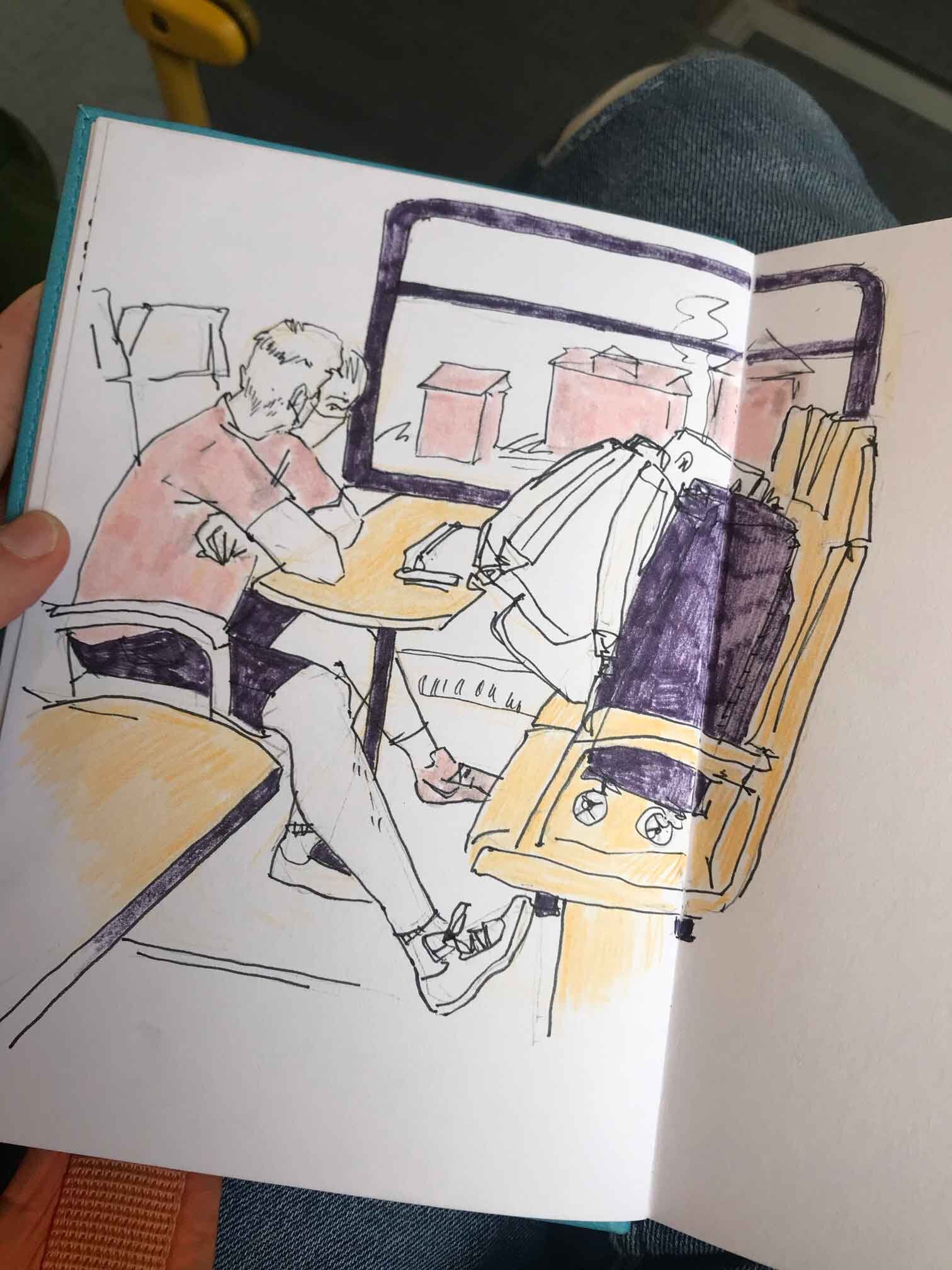
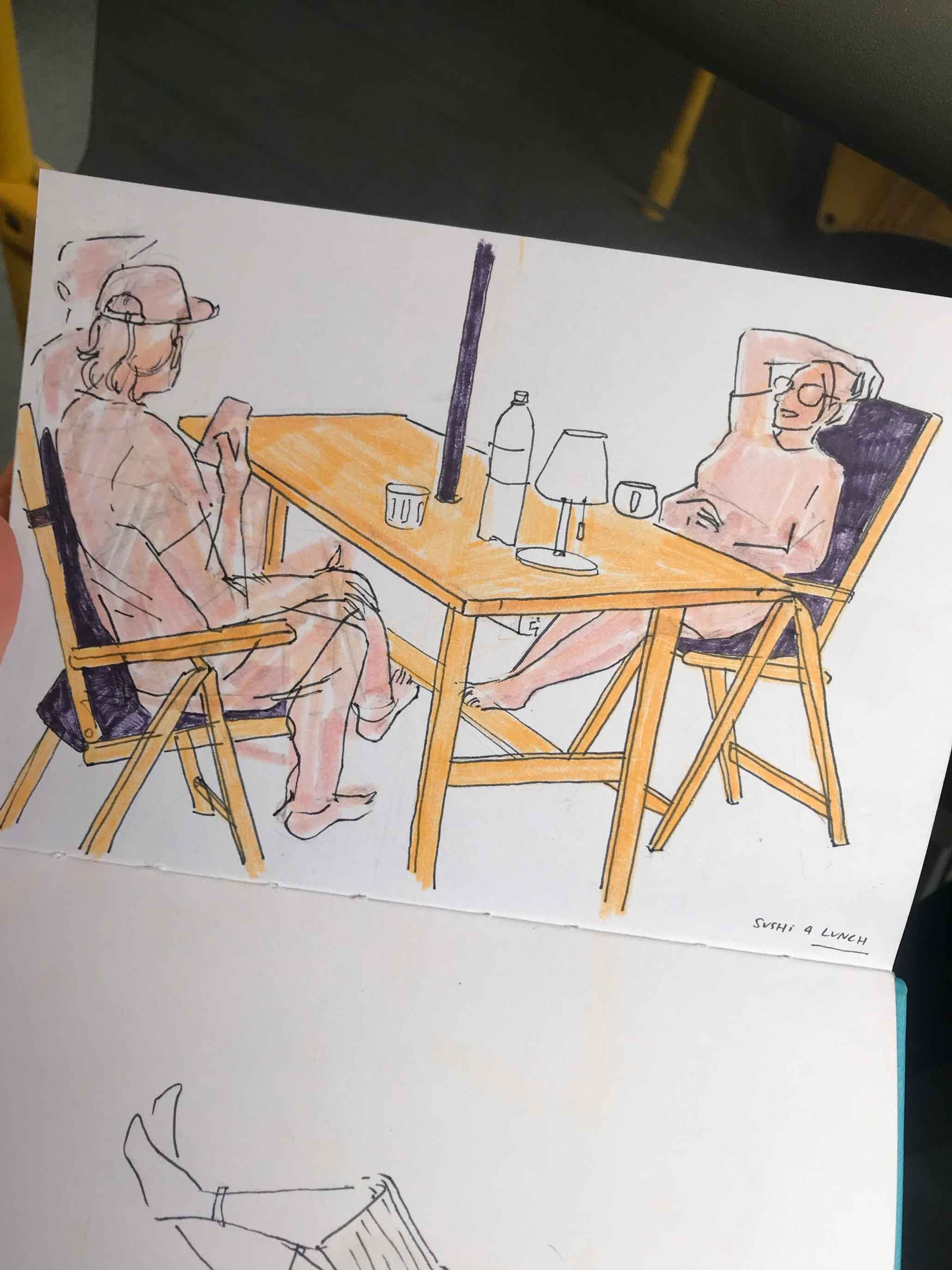
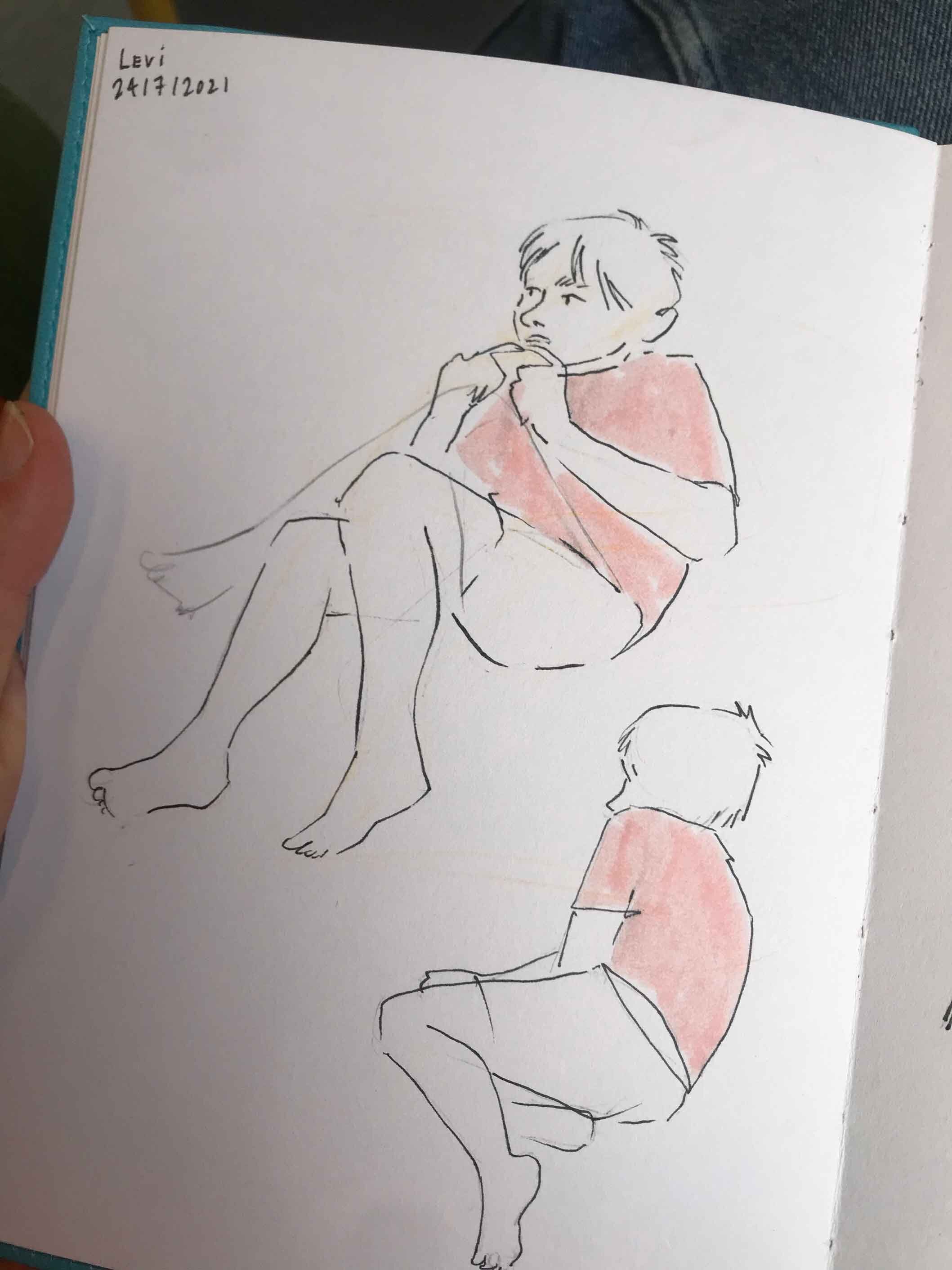
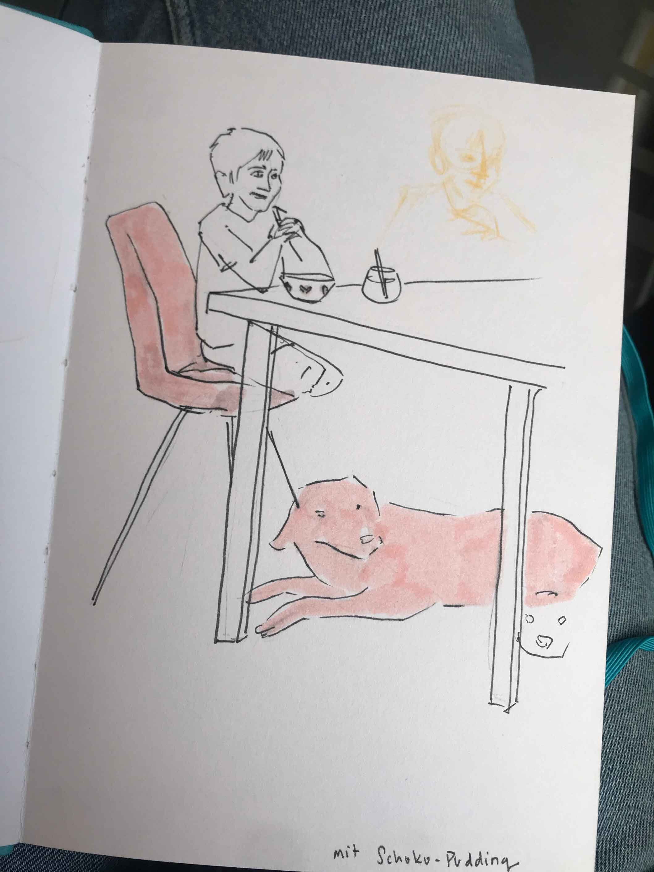
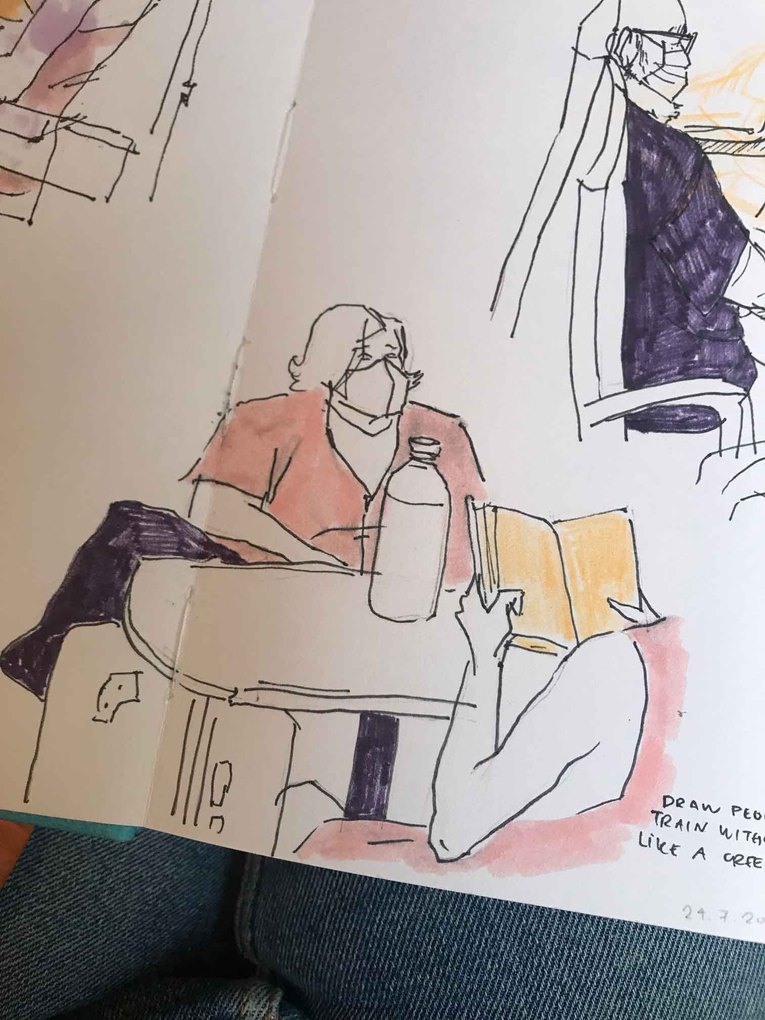
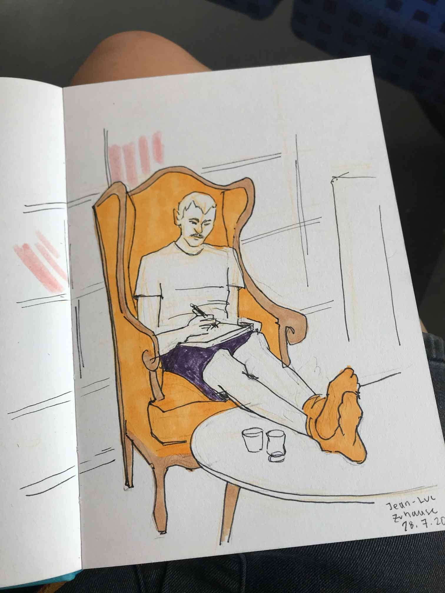
I’ve recently felt inspired to do more sketching. To capture the energy around me, and to keep drawing, even if it turns out bad. I haven’t felt that way in a long time. Perhaps it’s a summer thing. Overall, I’m prioritising mood over quality, though it’s also nice if the sketch turns out good at the end.
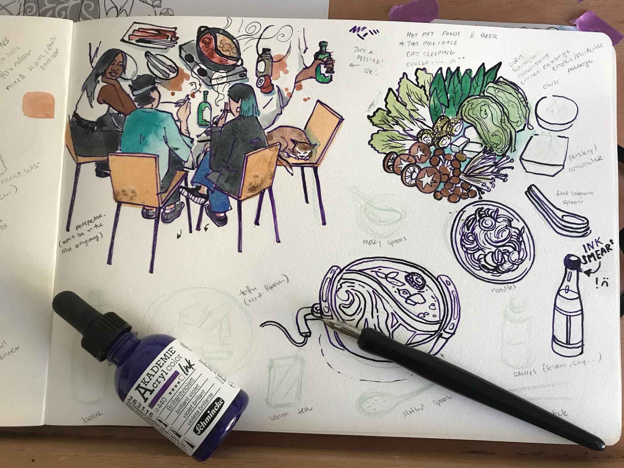
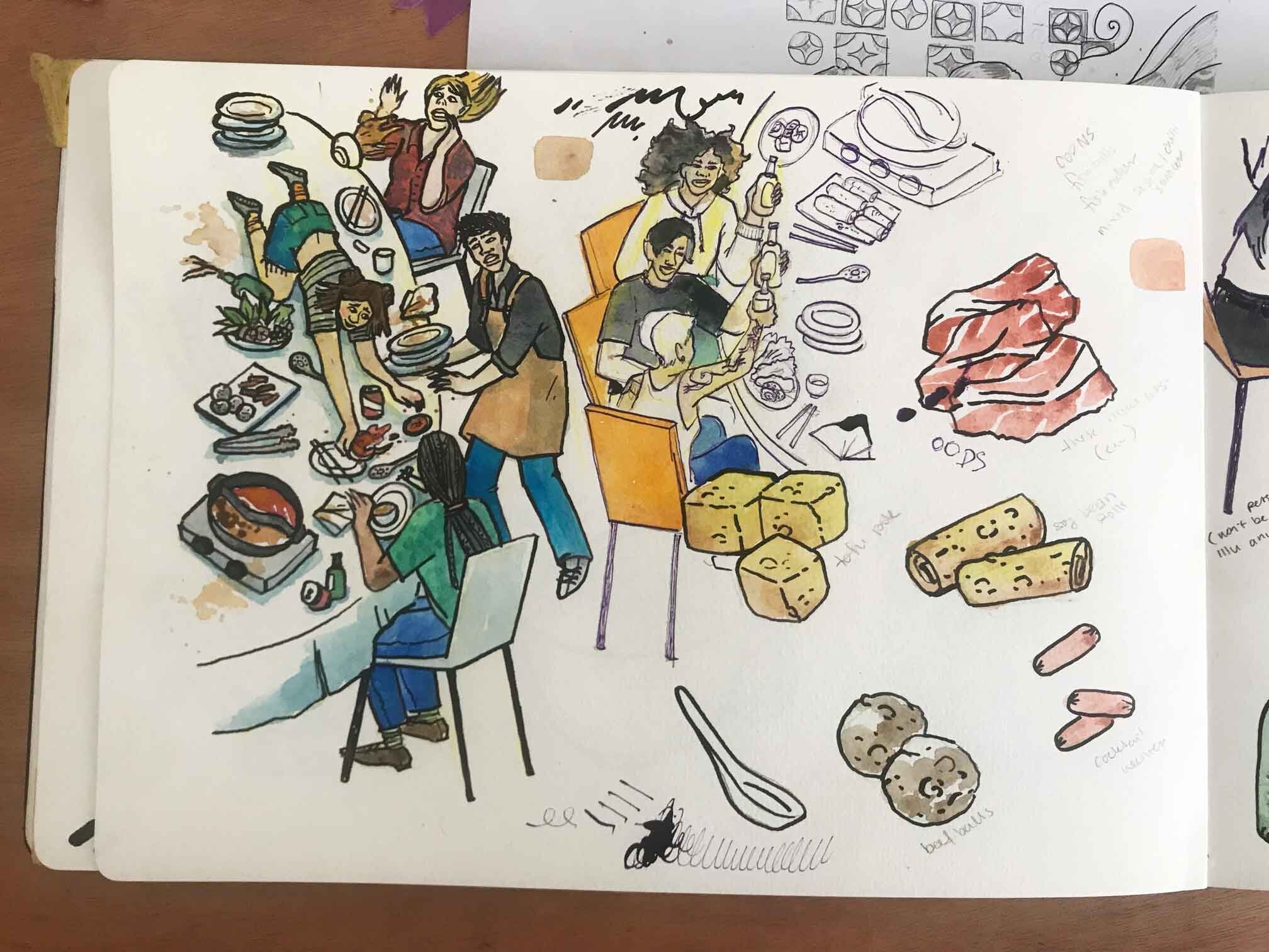
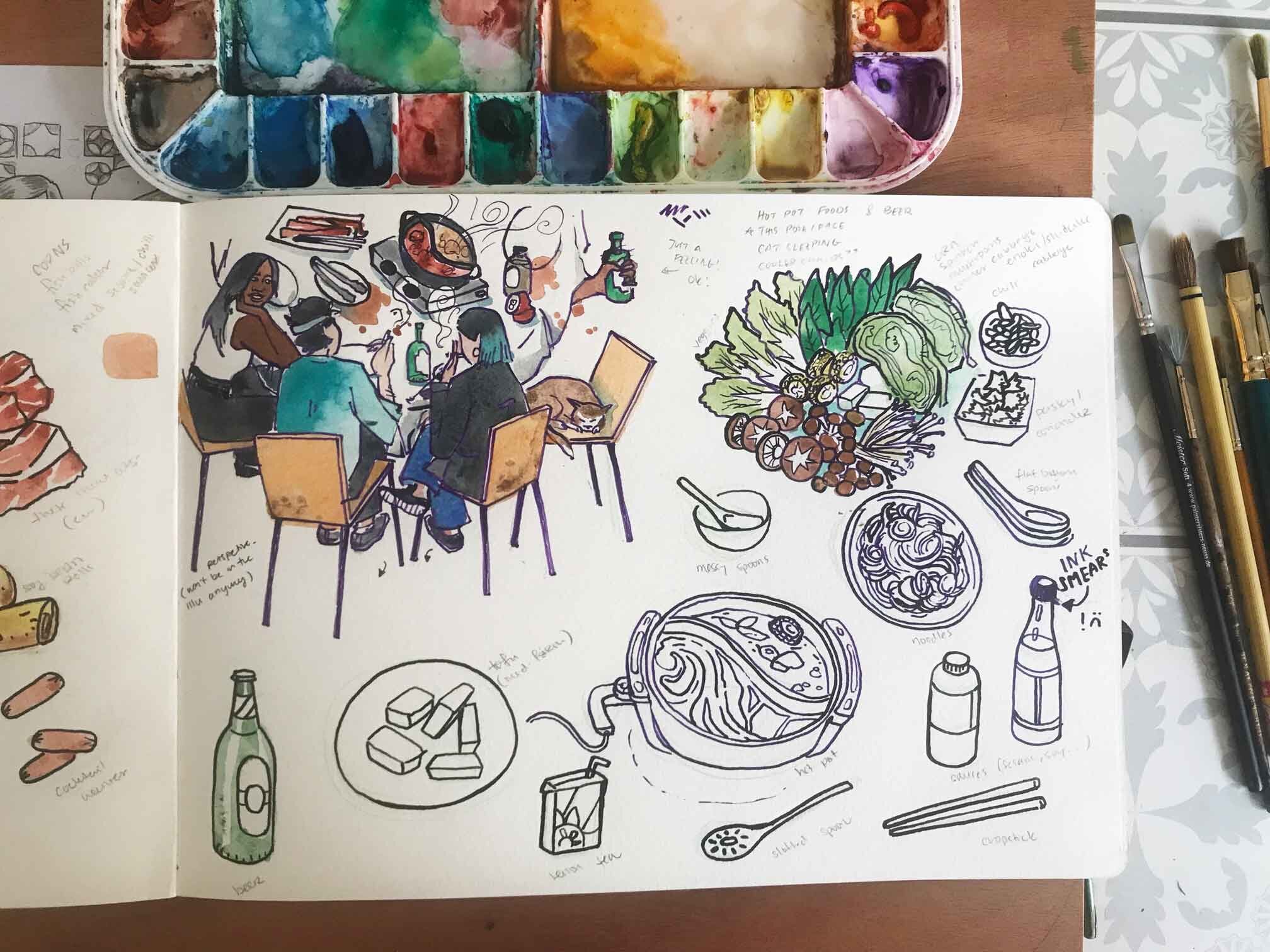
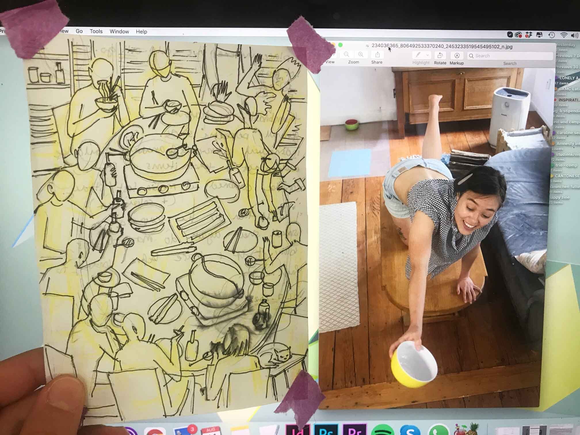
I’m also working on this piece that I’m just calling “hot pot” for now. I have a thumbnail composition already, and my plan of attack is to do studies of the individual aspects of the image before hashing out the final layout. Oh, and I’m experimenting with dip pens + water colour, and I really like it so far! My favourite part is that you can draw kind of crappy and this medium will make it look intentional lol.
In general I’m going for a more relaxed, imaginative and playful approach with this piece. I don’t want to always have to rely on reference images, and to check if every single detail is correct (my normal mode). It’s just so exhausting and really takes out all the fun. It’s hard to work alone because all I hear in my mind are those critical, perfectionist thoughts. I realised that I am a lot more easy going when I have someone to talk to while working. Just like in my personal life, I wish that in my working life, I had more of a balance between working alone and working with people around me.
In the mean time, my strategy is to be mindful – to notice when I have those extremely self critical thoughts, and then to let them go. It also helps to have relaxing music while working, here’s my drawing playlist in case you’re curious!
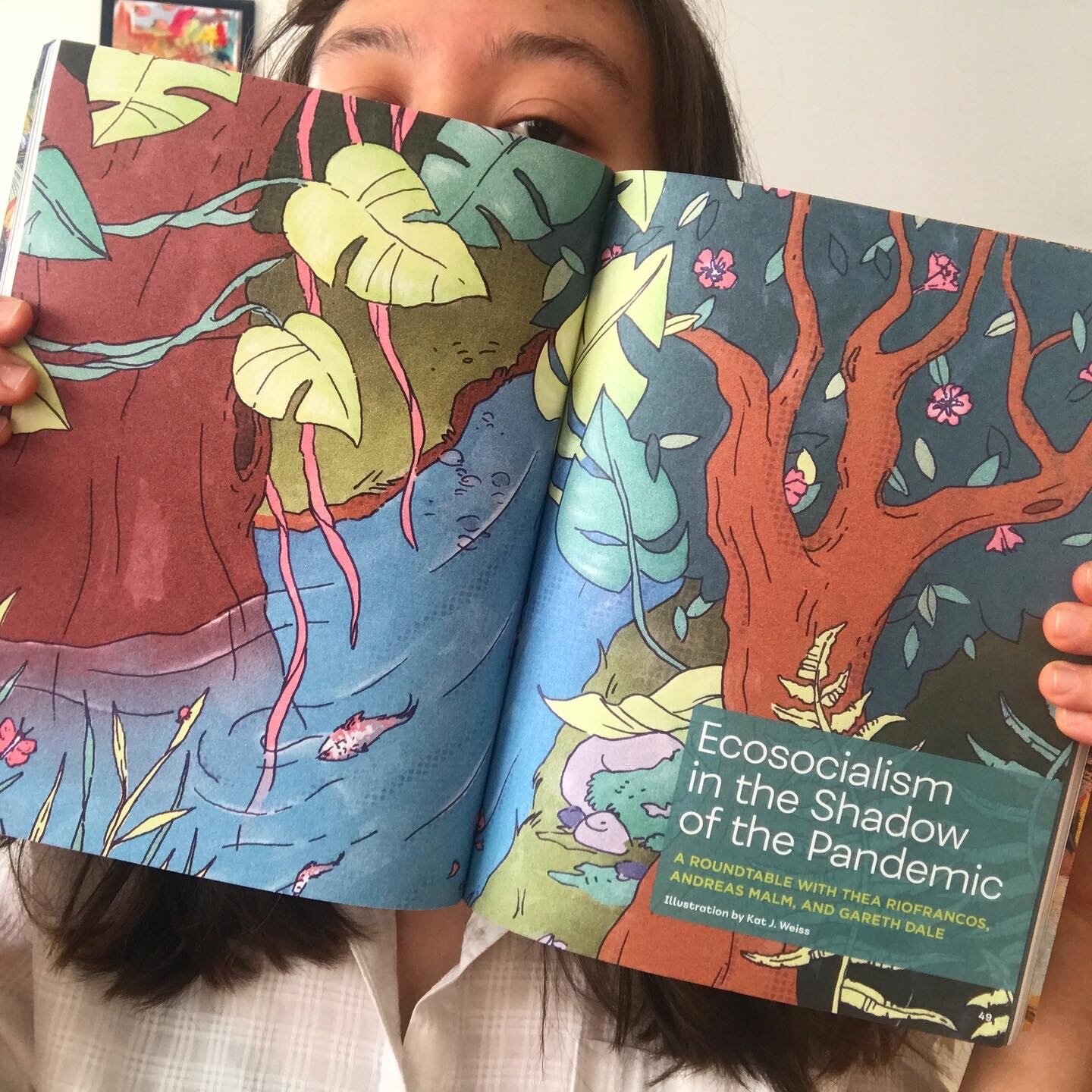
BTW, you’ve seen this already, but here’s the printed version of the feature illustration I did for Spectre Journal Issue 3! AD: Gabe Berlin, he was awesome to work with!
Finally, I signed a contract for another project with the Ban Ki-moon Centre in Austria. Here was the first project, in case you missed it. I’ll be starting next month, so I’ll keep you updated!
Finally finished this piece + does “correct perspective” make good art?
FKA the piece I never thought I’d finish because I didn’t like it, but – I recently got round to it because my agency was asking for “space themed” illustrations, so that gave me a lil kick in the butt. Sometimes in life you just gotta finish things you don’t enjoy. I look at it now and think “ok, this and this part* could’ve been better, but people seem to like it anyway and at least I finished it!” Yeah that’s all.
Space Café, July 2021
* If you’re curious about what in particular I’m not happy with in this piece it’s: a) the skater’s right arm b) the seated woman in the front/right – her right arm, too c) then in general the sense of depth in this environment, I’m not sure if I nailed it; perspective is not one of my strongest suit but I’m trying to improve it.
On the other hand, I can also make peace with the fact that, in general, a more symbolic perspective is more important to me than realistic perspective, ie it’s more important to me to sacrifice correct perspective in order to show certain details. I feel like if I were to show everything in 100% correct perspective, certain aspects, like a person’s outfit, or the contents of a table, might get lost. I hope that makes sense?!
If we look traditional Thai (temple) mural paintings for instance, a lot of it is completely flat! It’s definitely not true to life, but there’s a charm to this kind of representation, because it tells a story. It literally gives us a full(er) picture of the environment and what is happening in it.
I’m definitely not knocking people trying to master 3-point perspective, OK. I just think there are different ways to art good, and that’s all.
When your sketches are better than the final 😂 (Blast from the Past)
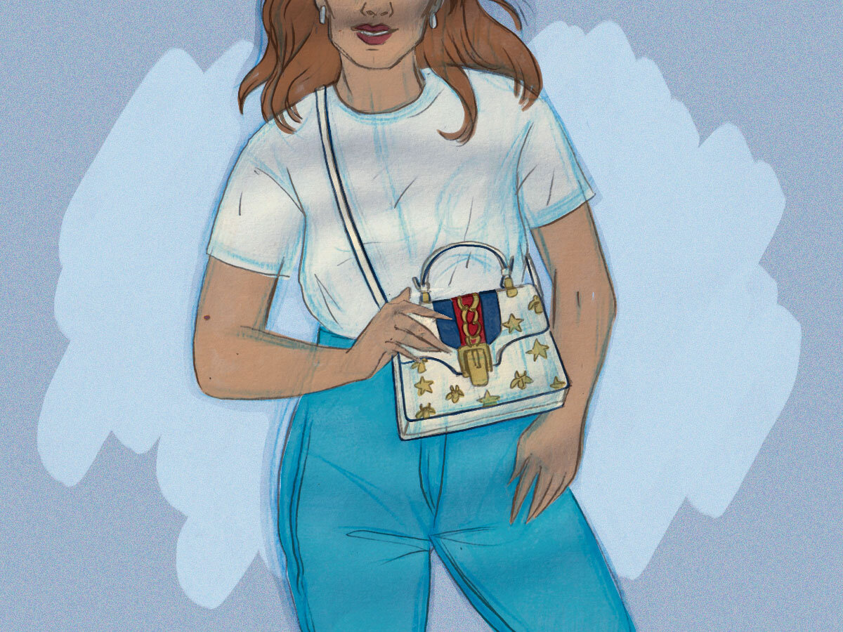
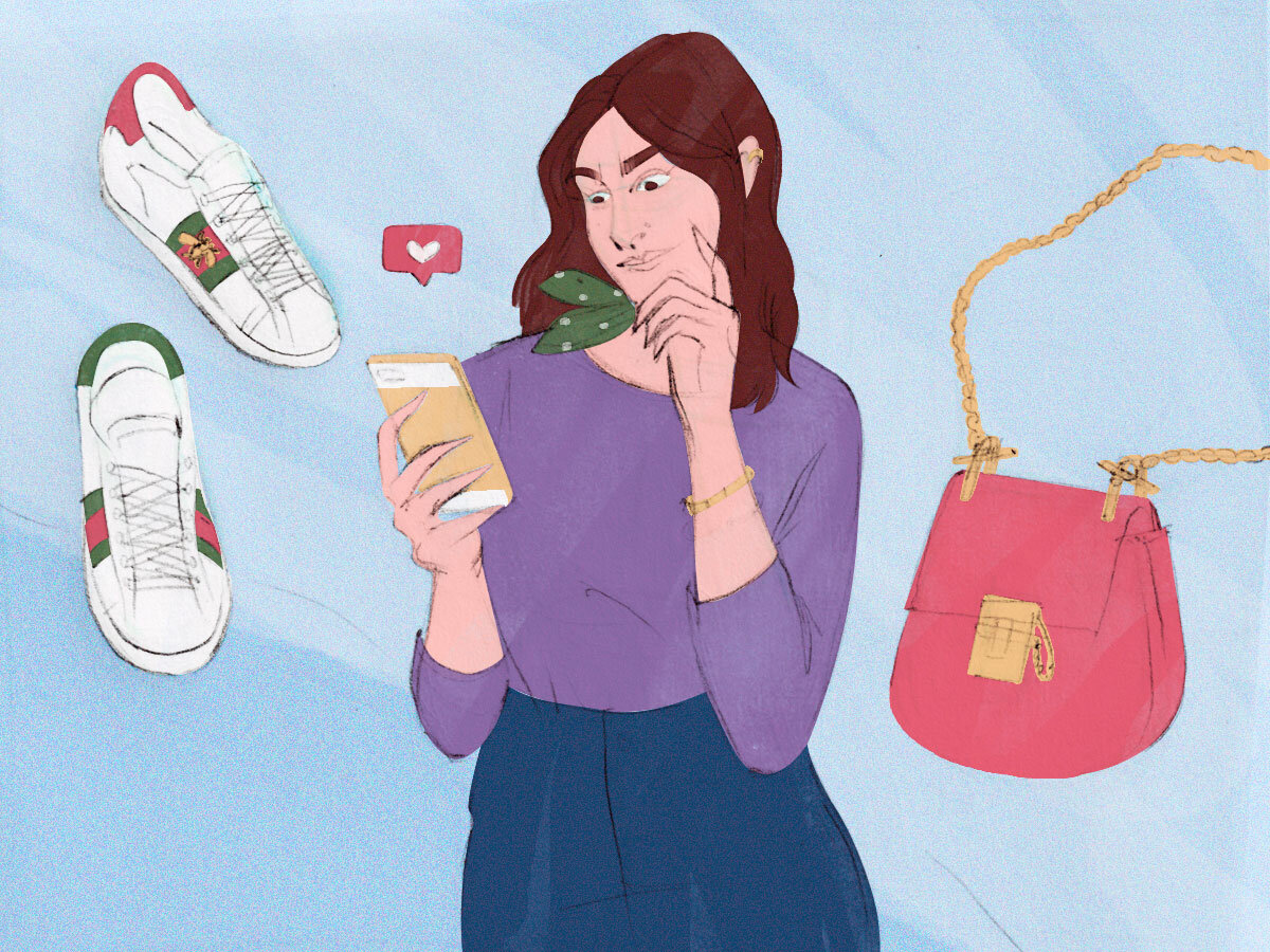
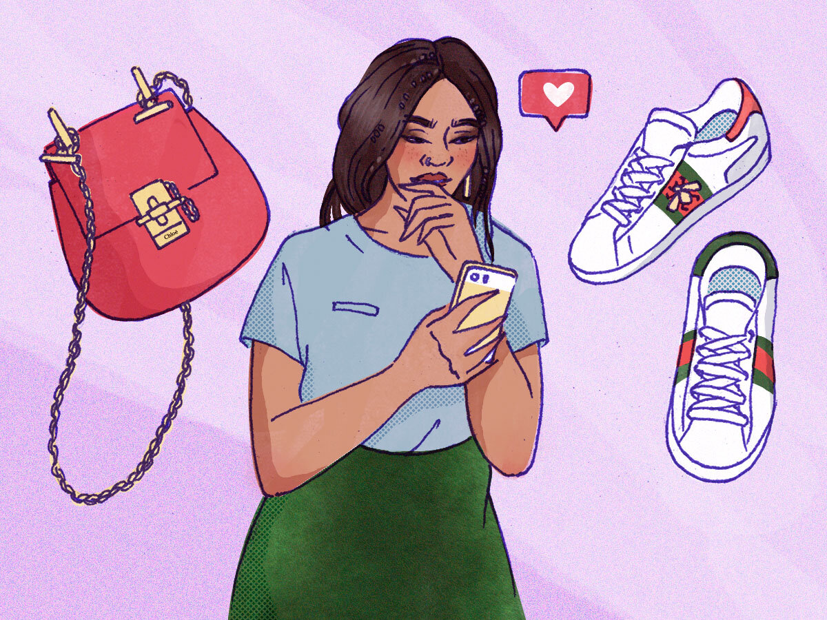
As I was just updating my website, I came across all the process sketches I did during my brief time illustrating for PurseBlog.
I was honestly surprised to find that some of the process sketches seem much nicer – with a lot more heart – than the actual final pieces?! I feel like there’s a lesson here but I don’t know what it is yet. Haha.
Anyway, let’s play a little game, I’ll do a side by side comparison of (L) the alternative sketch and (R) what ended up being the final, and you decide – via comment or simply in your head – which one you think is nicer.
alt. sketch
final
alt. sketch
final
alt. sketch
final
alt. sketch
final
alt. sketch
final
A new style / skill: Vector Illustrations
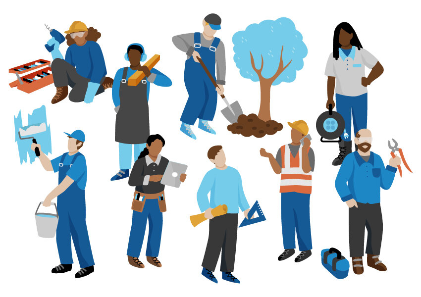
I’ve recently been working on a new series of vector illustrations for Craftview, a company which puts softwares for woodworkers, landscapers, construction workers, etc, all in one place.
Anyway, I never thought that I could do corporate-type vector illustrations or include that “style” into my portfolio somehow, but this project gave me the push to try. And, save for the line work that is normally evident in my work, I think it kinda fits with the rest of what I do? I mean, it’s people-focused and the characters look approximately the same, shape-wise. Let’s see what my agency (and the world) thinks. I hope this can open some new doors!
BTW, in order to keep the style somewhat in line with my other work, I did my thumbnail sketches the way I normally would, but then simply did a shape-based execution in illustrator (using mainly the pencil tool, not the pen tool, as this works with the organic shapes in my work).
What I appreciated / found interesting about this process: I felt like I was building dolls, but in 2D, and there were many instances where I could simply copy and paste existing shapes (heads, arms, legs…) to build new ones. Working with vector also means you can have the final output be virtually any size, but… that’s a given.
New! Euro Football Championships Illustration
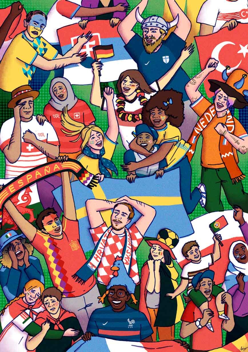
Euro Football Championships
June 2021
Mixed media / digital
I wish there was a better way to name this piece but… ah well.
Football is silly, hysterical, emotional, asinine, divine… I wanted to capture all of those emotions in this piece, while also creating a sense of togetherness (as usual). I really had fun with this!
I would say that it usually takes me about 2 weeks to finish a piece like this – as I am obsessed with detail – but since I only had a week for this one, time management was definitely in order. So I followed… my own advice, specifically some of the points I covered in my “How I finished 33 Illustrations in 12 Days” blog post, which you can now watch in a snappier, summarised audio-visual format (video)!
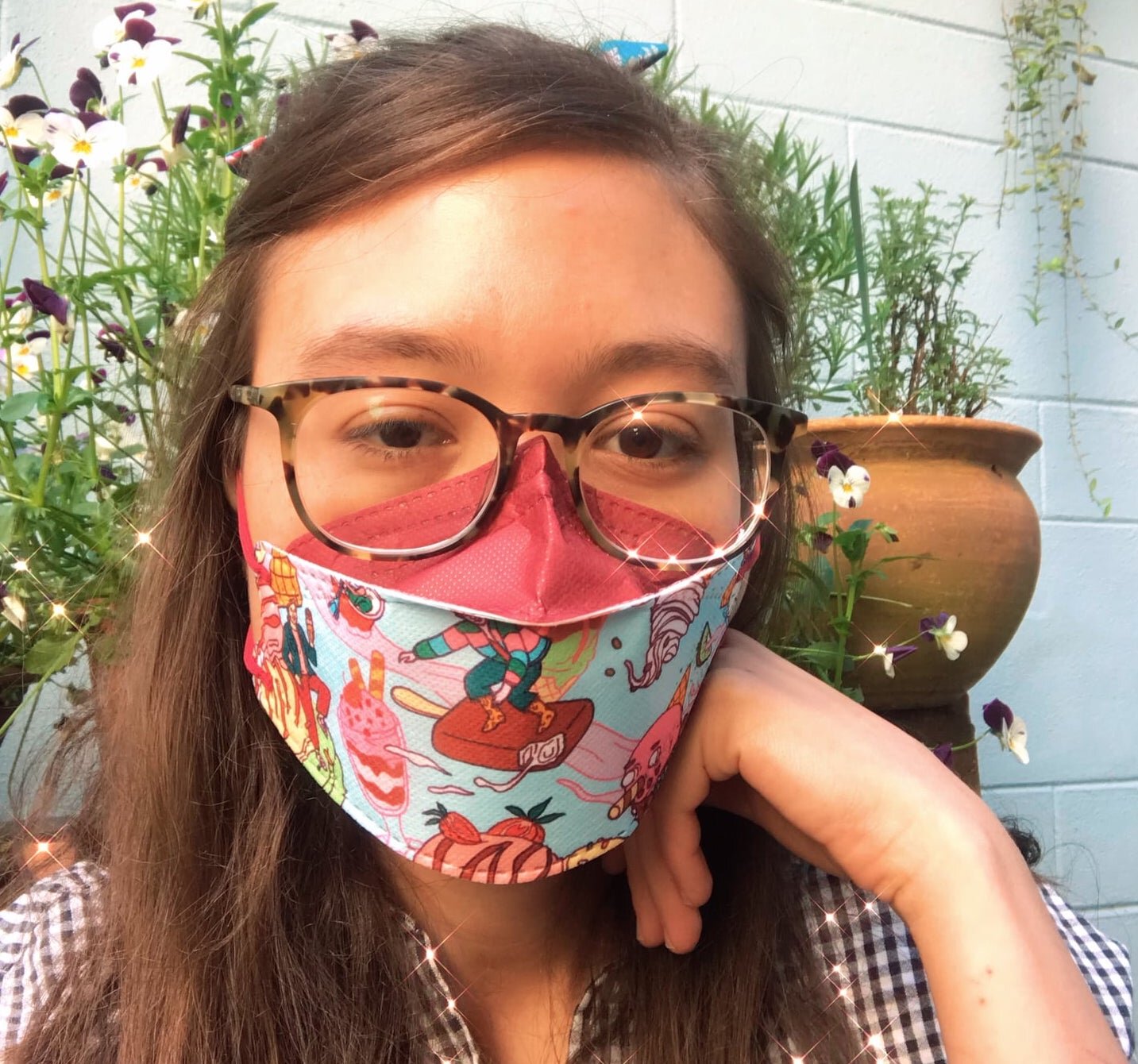
My FFP2 Mask Designs have DROPPED!
Earlier this year, I had the opportunity to work with a Hong Kong-based company that prints beautiful designs on surgical masks, as well as Korean-style FFP2 masks. As part of the collaboration, I developed a food-themed series. My statement on the piece:
The idea behind this series was to combine people + food in a playful and surreal way. Food is not only nourishment in itself, but also nourishment of the soul, and plays a big part in our emotions, memories, and sense of belonging – this is a celebration of that.
You can check them out – and/or buy them ;) – here.
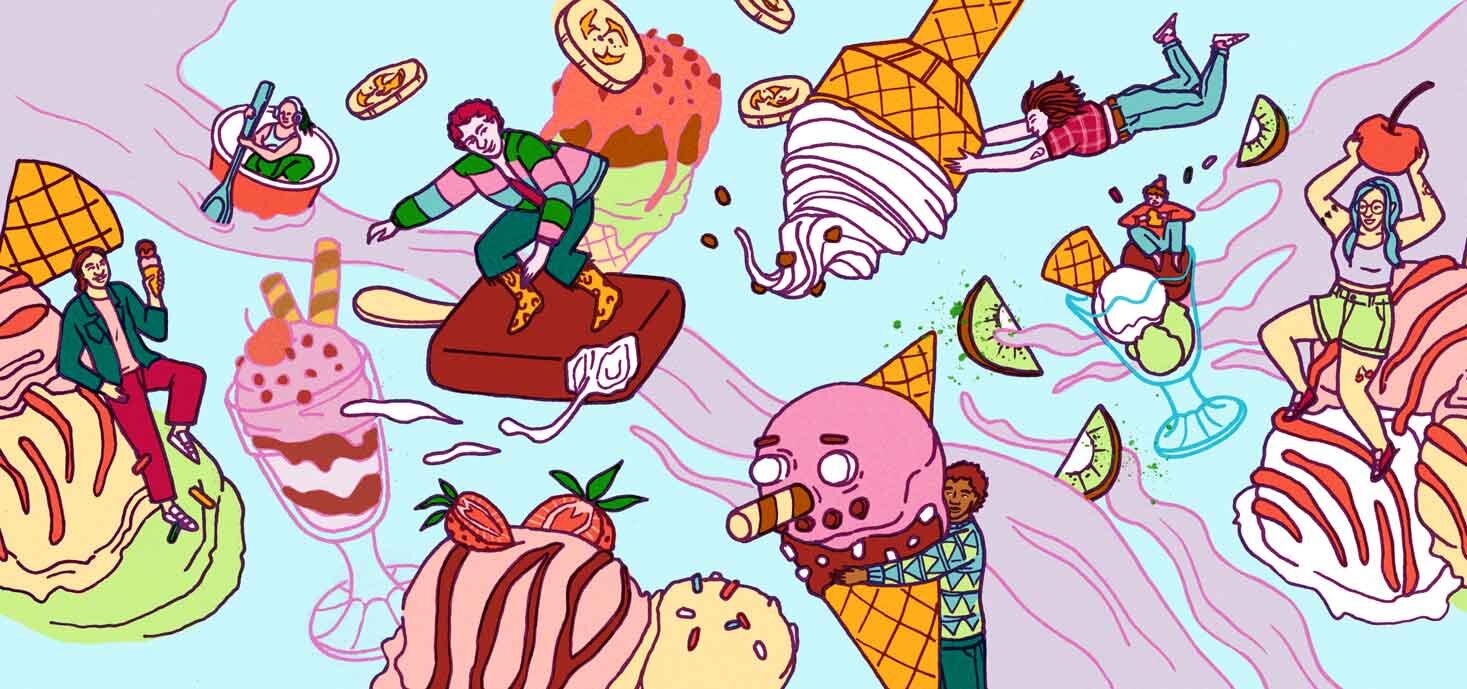
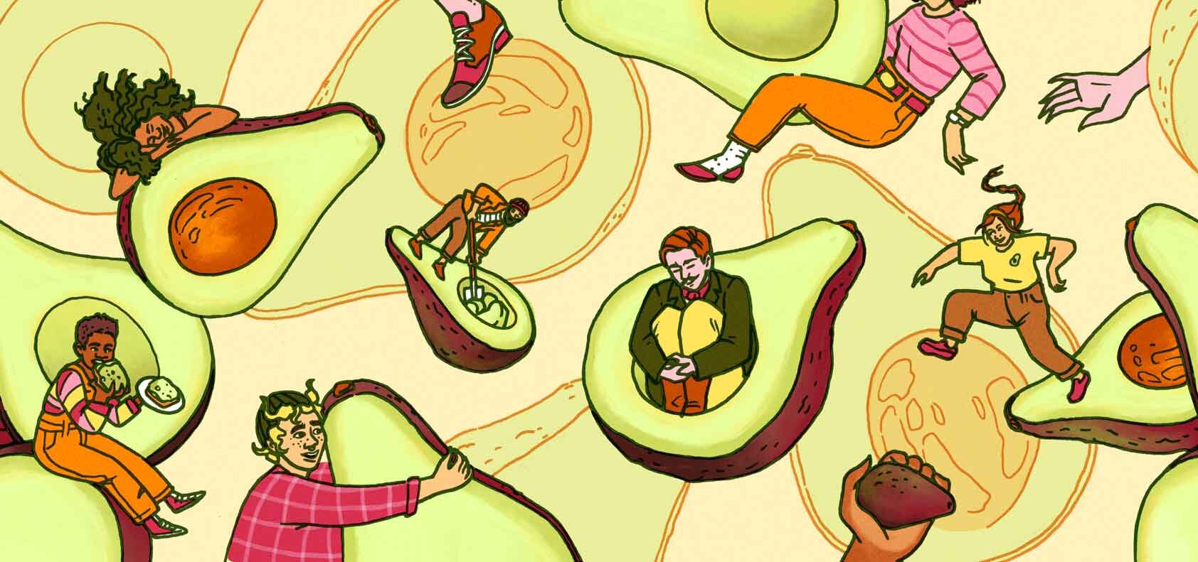
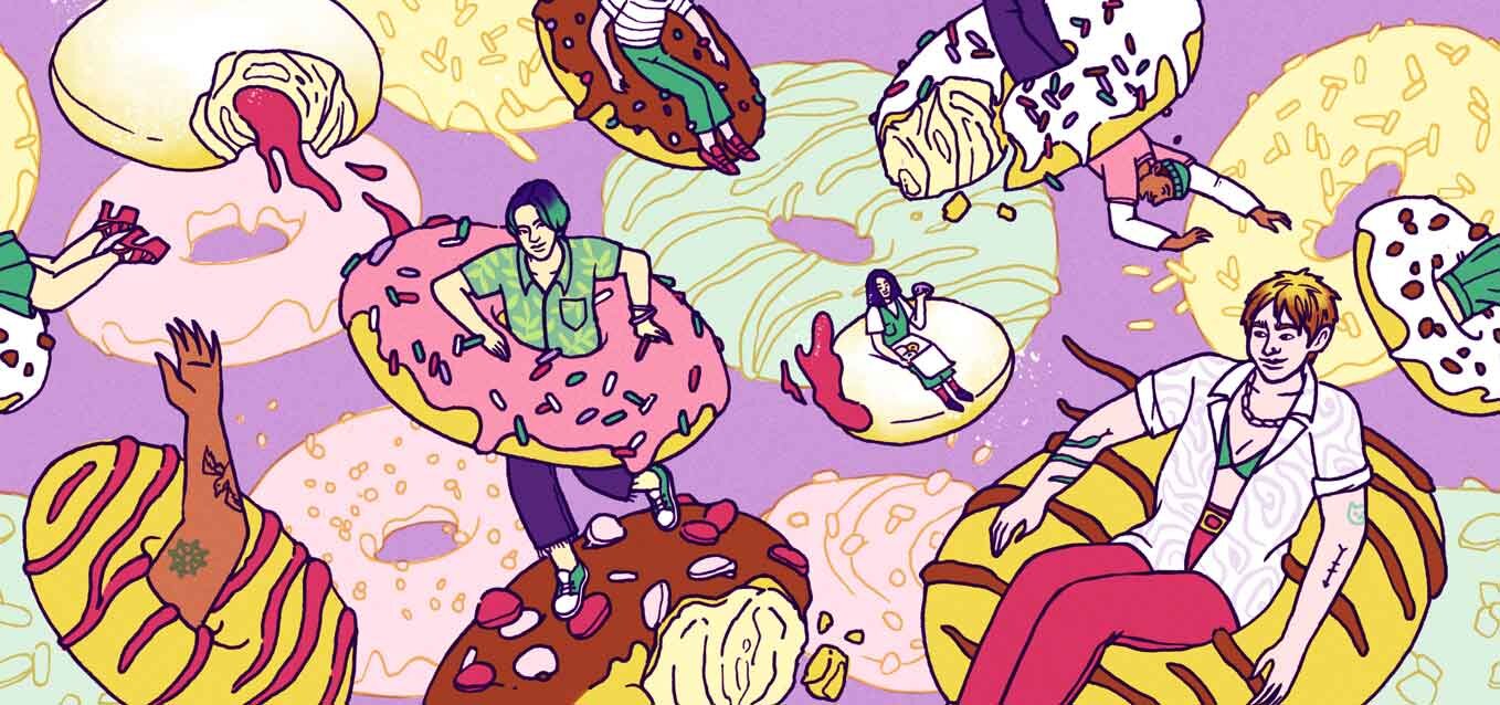
If you want to see a video/reel of my modelling the designs, check out my post on Instagram!
(maybe) Getting Hearing Aids at 29 – my hearing loss story
I went to have a hearing test and it turns out that I have light to moderate hearing loss, which mostly affects high-frequency sounds/soft consonants. I wasn’t at all surprised as I have known about my lower than average hearing for pretty much my entire life; certain people just sound like they are constantly mumbling to me, I am known to ask people to repeat themselves multiple times, and the fact that I might not hear a phone ringing or someone calling me is a common occurrence. I think it’s genetic because it runs on my father’s side of the family…
If you have never noticed this about me then it’s likely that it’s because we were together, in close proximity + in a quiet place, and you weren’t whispering. Other ways that I have “hid” my hearing loss are: a) through educated guessing about what someone might have said or b) simply ignoring the person or nodding and smiling (LOL sorry if I did this to you).
What I am actually pretty surprised about is that I am entitled to – that it’s actually being recommended for me – to get hearing aids. In fact, it’s recommended for even light hearing loss, which I suppose makes sense, because no one would ever say “Yeah, you could totally get by!” to someone with the slightest vision loss. Having hearing aids/hearing loss is still stigmatised, it seems. I think it’s getting better now, but growing up, I can tell you that not being able to hear properly was very rarely met with any kind of understanding or empathy. It was almost always met with annoyance and impatience – treated as if it was my fault.
My audiogram results for a better explanation of my hearing loss. Any point greater than 26dB is considered hearing loss. More information on degrees of hearing loss here.
Once I get the chance to do another hearing test at a doctor’s, and they give me a proper prescription, I can get health insurance to cover a standard pair of hearing aids. If not, then, we’ll see… right now I’m testing a pair of hearing aids that the local hearing aid dispenser gave me to try for a week, and here’s what my audio experience has been like so far:
I can hear way more rustling and crackling in my surroundings than before, which is sometimes annoying and can lead to “sensory overload” (as I am writing this, I am feeling weirdly fatigued and unfocused, so I’m taking a “hearing aid break”)
My own voice sounds like I am speaking through a metal box, kinda
Children sound like robots
Any recordings coming out of a device sound extra metallic
Overall, any high frequency sounds have more of a “vibration” to them
WOW, none of that sounds actually beneficial, but I think I need to test out speaking to people in noisy places, or speaking to children and people that mumble by default (also children, mostly). If I don’t end up getting hearing aids because $$$ or whatever, then I suppose the only message that I want to send with this is to please be more patient and understanding with people that can’t hear properly, or otherwise have more difficulty understanding the world than you do :)
How I finished 33 illustrations in 12 days (advice for tight deadlines / quick turnaround times)
Because it was such an intense process, I feel like I was thrown into a pressure cooker and came out a more knowledgeable and experienced artist – so much so that I would like to share everything I’ve learnt!
Read More


